
If you’ve ever built a website or app yourself, you know that for a great finished product, you need more than knowledge of coding. You also need basic design skills.
First impressions matter, and the first thing a user will judge your project on is its design. If the finished product doesn’t look good–or, worse, makes the website or app difficult to navigate–no one will use it.
By learning just a few design basics, you’ll dramatically improve the quality of your projects. And when it comes to collaborating with designers on bigger projects, you’ll have gained valuable insight into their job, which will make your partnership that much easier.
Disclosure: I’m a proud affiliate for some of the resources mentioned in this article. If you buy a product through my links on this page, I may get a small commission for referring you. Thanks!

In this guest post, co-founder of RookieUp Alec McGuffey walks us through 7 principles of design for programmers. By taking just a few minutes to read this article, you’ll be able to apply some graphic design basics to your projects and increase their chances of success.
Building cool projects is one of the most exciting parts of learning to code. When you’re just getting started on your coding journey, you might come up with an amazing idea and want to immediately begin figuring out how to make it real.
But as you expand your skillset and start to build projects that you’re planning to actually launch into the world to be used by real people, it’s important to consider how your project is going to look and function from a user’s perspective.
Whether you’re an aspiring back-end developer trying to launch a career building amazing apps, a front-end developer interested in creating dynamic websites for clients, or anything in between, incorporating basic principles of good design into your projects is crucial if you want to code digital products that are relevant and delightful to users.
When you’re so focused on learning how to code in the first place, I know learning how to design might seem superfluous, if not downright burdensome. That said, it doesn’t have to be difficult–and the earlier you start, the more seamlessly you’ll be able to integrate your coding and design skills into the things you build.
In this article, I’m going to share 7 principles of design to keep in mind as you build up projects.
By incorporating design fundamentals and user-focused thinking into your web development process, you’ll be setting your projects up for success from the start, rather than having to figure out why people aren’t using your projects after you’ve spent hundreds of hours creating them.
Learn Design Principles, Not Just Technical Programs
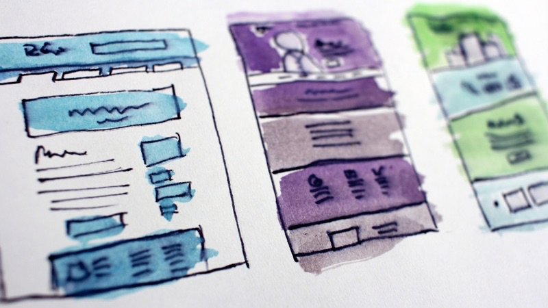
First things first: when you decide to start applying principles of good design to your coding projects, it can be tempting to dive straight into the technical tools and learn programs like Sketch and Illustrator first (especially with millions of search results for “Learn Design” just a few clicks away).
Why waste time learning the fundamentals of graphic design when you have good taste and want to get a job done ASAP, right?

Unfortunately, it’s not quite that simple. Apart from the fact that that you’ll improve much more quickly if you learn basic design principles first, you’ll also be setting yourself up for success when you’re getting ready to actually turn your coding projects into beautiful final products.
Being able to apply basic design principles is crucial if you want to turn your initial ideas into clean final products.
And if you need help coming up with projects and applying graphic design concepts to them to create awesome final products, check out the Portfolio Starter Kit, a comprehensive library of projects, resources, and guides that will teach you how to think like a designer and apply elements and principles of design to your coding projects so they really make an impact on users.
No matter what kind of coding project you’re working, the Starter Kit probably has a step-by-step guide to help you turn that project into a beautiful product.
Alright, now that we’ve gotten that out of the way, let’s dive into 7 principles of design to consider when you’re putting together a new project.
The 7 Principles of Design
1. Alignment
Alignment is one of the most basic design principles, and one that you’re probably already familiar with if you’ve ever opened a word processor (or even a text editor).
Alignment refers to all of the text and graphical elements on a page or screen being lined up in a consistent fashion. A few common examples of alignment are left-justified, right-justified, or centered (all common settings in word processors).
By aligning all of the elements on a page, you’re creating an invisible wall that makes the design consistent and provides a more easy-to-follow experience for the user. Grids are used to easily maintain consistency and alignment between elements.
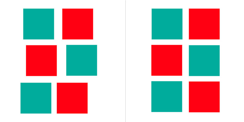
2. Repetition

Repetition can refer to a number of things in design. One common meaning is the reusing of patterns, text, images, or graphical elements (maybe changing them slightly to create a certain effect) across a design to create a feeling of consistency and unity in your design. Repetition of elements creates a sense of action and connection between elements of a design.
Repetition doesn’t mean that the elements you’re repeating have to be symmetrical or aligned in any way. In fact, repeating the same element but changing the way it is arranged on the page can be a very effective technique.
3. Hierarchy
Hierarchy is a design concept that focuses on the arrangement of elements on a page in order to create a sense of importance between elements.
The human brain will naturally first look to elements that are larger, bolder, or more unique. When you’re designing your projects, pay careful attention to the way you use font sizes, the order of different elements, and their color/weight.
If you’re working on a UX/UI design project, think about the main action you want a user to take, and ensure that this element has a higher hierarchy on the page than the supporting copy. This could be accomplished by increasing the font size or weight of the most important element or by making it a more unique color than the rest of the elements on the screen.
4. Balance
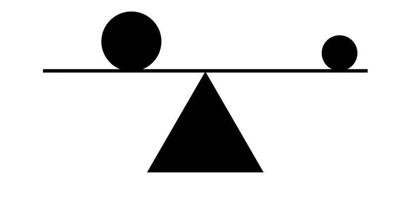
Balance is a principle of design in which you create a page using an appropriate balance of symmetry and asymmetry, as well as positive and negative space, to ensure that no single element of the page overpowers any other element of the page.
If you have an unbalanced design, you risk letting a certain element of the design overpower the entire page, making the rest of the page fade into the background and lose purpose.
Symmetry of design is one way to create balance in a design. Think of a scale with equal weights on both sides, placed the same distance from the center.
On the opposite side of things, asymmetry can also be used to create a sense of balance. Using the same metaphor, consider a heavy weight on one side of a scale (but placed very close to the center) and a lighter weight on the other side (but placed much further from the center).
As long as the weight and distribution of elements is consistent and doesn’t create too much visual tension, your design is still balanced.
In a UX/UI project, for example, you might have a large single element on one side of the screen. If you just had one small element on the other side of the screen, the page would feel unbalanced to the eye. However, if you counter the one large element with a lot of smaller elements grouped together, you can still achieve a sense of balance, as the overall “weight” of the smaller elements will counterbalance the single larger element.
5. Contrast

Contrast is the usage of elements in a design that are inherently opposites so as to create a sense of visual interests and excitement.
For textures on your page, this could be smooth and rough textures. For colors, it could be light and dark shades. Contrast is crucial if you want your designs to be interesting for a user to interact with!
6. Color Theory

The usage of colors is one of the most important aspects of a strong design. Color, when used effectively, can instantly cause someone to feel a specific emotion or think of a certain brand.
It’s almost just as important when choosing colors not to use too many colors. Try to keep your design to two primary colors and two secondary colors. When possible, use colors that all work synonymously with each other. Check out this list of amazing tools you can use to create pleasing color palettes for your projects.
7. Typography

Typography is another important element to consider when designing any project. Typography can be used to create a variety of different feelings in a user and can subconsciously inform them about the nature of your product.
If you’re designing a B2B app for a large corporation, you might use a simple sans-serif font so that your typography matches the corporate nature of the actual product and doesn’t distract from the functions of the app. And if you’re designing a playful interactive website, you might use a looser serif font to capture that whimsy.
Think about the feeling you want users to have when using your product when choosing your typography. You should remember to consider consistency when choosing fonts. Try not to use more than two unique fonts for any specific project, so as not to overstimulate users and cause visual confusion. Google Fonts is an incredible tool for finding free web fonts.

Two UX Fundamentals to Keep in Mind
Once you’ve learned the 7 principles of design outlined above, it’s important to also remember a couple of the most important UX fundamentals to ensure that you’re building projects that are well-researched and tested with real users.
1. Research
First things first: when you have an idea for a cool coding project, do research to see how other companies have solved the same problem. Research other businesses within the same market. What are some trends in the industry?
Familiarize yourself with the average user of products in this space. Who are they? What makes them choose one app or product over another? Do they use this application every day or only occasionally? Think about what the consumer looks for in their ideal app and what drives their decision-making process.
When you come up with a cool idea, it can be tempting to jump right into building it. But if you want to create something that’s truly useful, it’s important to get to the root of the problem you’re solving and figure out who you’re solving it for. Then, you can tailor your project to the needs of that audience.
Create initial user personas and use cases based on who the intended end users are and what purpose they’ll use the app for. If possible, try to create at least two different personas so that your end designs take into account needs of different types of users.
2. User Testing
Once you’ve done your research and maybe wireframed what the end product will actually look like, it’s important to test your assumptions on real people!
This is even more critical when you’re creating theoretical portfolio projects. In a real-world setting, you’ll constantly test your assumptions with real users or colleagues, iterating as you go until the interaction of every screen has been tested and perfected. But when you’re creating projects from scratch, you won’t have as many chances to test your designs against real users unless you seek out opportunities to do so.
We suggest working closely with a mentor as you design this project, or enlist the help of friends. Ask them to go through the flow of the app and point out any screens where they are confused what they should do or situations when they click something and land on a page they were not expecting.
Conclusion
While these 7 principles of design might seem like a lot to keep in mind when you’re focused on coding your project, most of these principles are actually pretty logical, which should make them easier to remember.
Let’s summarize!
You want your designs to be consistent. You don’t want to use too many competing sizes, weights, or styles. You want to make sure everything is aligned and looks visually appealing so that no particular element of your project overpowers the other elements. And you want to make sure that you figure out what problem you’re solving and who you’re solving it for before diving in.
By applying these design fundamentals to your coding projects, you’ll be setting yourself up for success and ensuring that you build something that people will actually enjoy using. Isn’t that your goal at the end of the day?
If you’d like more help coming up with ideas for awesome projects and building them into beautiful and well-researched final projects, check out our Design Portfolio Starter Kit, which gives you tons of projects, resources, and tools to help you take your ideas and turn them into beautiful final products.
We created it specifically to help designers and developers at every stage of their careers learn the principles of design and teach them how to apply those principles to their projects, whether you focus on coding projects or pure design projects. For just $49, you’ll get hundreds of hours of curated curriculum, 40+ step-by-step projects, tons of design resources and guides, entry into our private feedback group, and hundreds of dollars of perks so you can get free and discounted access to design tools like Sketch, Flinto, Balsamiq, Figma, and more!
About the Author

Alec McGuffey is the co-founder of RookieUp, a design education platform that offers short-term bootcamps and portfolio-building tools to give aspiring designers everything they need to build an amazing design portfolio and launch their design career.