
If you mange your own website (or create ones for clients) and ignore user experience (UX), you’re making a huge mistake.
When I first built this very site, that’s what I did: I ignored UX. I didn’t take any consideration of the people that would be using my site. I only thought about what I wanted.
Fortunately, as I rebuild Learn to Code With Me, this is no longer the case.
When it comes to design, whether for a website, mobile app or even a physical product, every decision should be based in the end user.
Design Should Never Interfere with the User’s Experience
In the film Objectified, the Japanese designer Naoto Fukasawa is interviewed. Out of the entire film, his interview was one of my favorites. And he sums up design concepts perfectly by using various metaphors — including a person who writes with a pen. (Watch the entire interview here.)
I’m embellishing a bit but basically he says that when a person is not thinking about themselves using the pen, the best writing occurs. Their creativity comes alive, and words flow through them with ease. Because if they are preoccupied with contemplating how to use the pen, that it’s hurting their hand, and so forth — how can they produce possibly produce the best writing?
The point is: create tools that plug into natural human behavior. A person should be able to use a product without thought. And the product (or website) itself should never get in the way.
Bringing all of these thoughts back to website design and development — create a site that does not impinge on the user getting what they want from the site. Navigating the site structure should not be an obstacle. Instead, it must be thoughtless for the user.
All of this may sound a bit philosophical, or woozy, for some people.
But this is how our websites or mobile apps should be: simply serve their purpose. That’s it.
Design shouldn’t take away from the purpose of the site, only the necessary elements should be included. (Read: don’t use fancy design transitions just because. Only do so if it’s essential to the function and purpose of your site.)
But then the question becomes, How? How do you create a product, or website, that simply serves its purpose.
The answer is based in who your user is and what they home to gain from using your website.
The User Is At The Center Of The Website Design Process
To discuss proven strategies to find your audience as well as discover their reasons for using your site, I spoke with Vedran Arnautović. Vedran is a developer turned UX designer based in Melbourne, Australia. Today he works for Seek, Australia’s biggest job marketplace.
Okay — let’s get into it.
First, Vedran makes it clear that you must start implementing UX in your site design, or redesign, as early as possible.
According to Vedran, “If you find yourself wireframing, and you haven’t considered the overall, it is too late.”
He continues,
“Every website solves some sort of a problem, even if it is just providing information for a particular domain. In order to solve a problem for someone (a user), you need to understand who that user is, where they are coming from, where they are going next.”
Before building your website — even mind mapping or wireframing it — it is crucial to analyze your users and their reasons for using your site.
“So, before you start wireframing or working on IA (information architecture) or the content, you really need to understand your user. This is the first part of UX thinking for a website design.”
When it comes to discovering who your users are, obviously you must communicate with said users.
Vedran suggests,
“Do the research, talk to users, understand what they are trying to achieve by coming to a website like yours. Alternatively, if you are working on a novel concept, form your hypotheses (why would someone want to come to the site?) and then test those hypotheses with potential users.”
3 Ways To Discover Your Users & How They May Use Your Site
Below are 3 strategies to discover your user and what they’re looking for on your website. Additionally, they can help you understand how users may use the website and what they expect from it.
1. Construct a User Journey (AKA, Story Map)
After gathering initial user research, Vedran strongly encourages mapping out a user journey.
“Even if I have a good reason not to do user research for a particular project (e.g. a well understood user base), I never skip user journey mapping. This is a key part of UX design when designing a website. Where are your users coming from when they get to your site? What could they be doing at the time? How are they going to navigate through your site etc. There are many useful formats for this, but one I’ve used recently is called Story Mapping and works quite well, especially when you want to call out some important details of your designs early on.”
Vedran recommends this article on Medium as a resource, which gives directions how to create two different types of story maps.
I did this exercise — just on a piece of paper — and it really helped me get into the mindset of what brings a user to my website. Moreover, potential ways I could optimize their experience once they get there.
Even better, this exercise is completely free! (Even more of a reason to do it.)
2. Card Sorting to Determine Information Architecture
When it comes to a website’s structure and information architecture, Vedran shares a popular UX technique called card sorting.
“If you are talking about information architecture of the whole site, activities like card sorting are invaluable. It’s not really a ‘hack’, but a tried and tested technique. It’s not complex – anyone can learn how to do it. You don’t have to take the results of card sorting as gospel, but it certainly gives you a great starting point. You should always go back and validate your information architecture using ‘tree testing’.”
Basically, card sorting is the practice of finding out how other people (users) group your site’s content.
There are three basic steps to card sorting:
- Define cards (AKA topics)
- Get potential users to sort cards
- Identify patterns found
Card sorting is a strategy to help understand user patterns. It is especially helpful in determining information architecture, menu structure, and site navigation.
Of course, there is software out there to help you with card sorting. Vedran suggests OptimalSort.
The only downside I see to card sorting is that is costs money. From the research I did, I did not see any free tools out there. (Which would be impressive since it involves real-life people sorting through the information.)
Of course, you could do everything by hand and then sort the information manually. Nonetheless, you would still need to find participants.
At the moment, I don’t have a couple hundred bucks to invest in card sorting. However, if you are a more mature business, or have spare change, this would be a fantastic investment. (And something I would surely consider.)
Along with card sorting, Vedran also mentioned tree testing.
Tree testing is a way to test findings from card sorting.
Typically, tree testing is done by presenting participants with realistic tasks, asking to find items by clicking through multiple layers of an information hierarchy. (The information is presented in a bulleted list format.) Participants then select a final category where they would expect to find said item.
Tree testing helps ensure a reliable site navigation is in place before building prototype.
3. Look at Existing Engagement Statistics & Compare to Redesign Goals
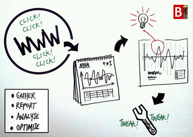
Image found via Flickr
This applies specifically to those who already have a site, not those building something entirely from the ground up.
When you redesign a site, you should always establish set end-goals about how you want usage analytics to improve.
“I find it useful to look at the usage and engagement statistics – how are the different sections of the site being used – and comparing those to the stated goals and objectives for the redesign project. Where are we trying to make an impact and by how much. Sometimes after looking at the statistics, you realize some parts of the site don’t perform as badly as assumed or presented in the problem statement.”
There are many different analytic tools out there, ranging from free to very costly. Personally, my two favorites for looking at usage and engagement are:
- Google Analytics
- SumoMe (Specifically, the heat map and content analytic tools)
Both give clear insights on usage and engagement. Both are free. (However, if you’re looking for something more in-depth and have a budget — check out Crazy Egg or KISSmetrics.)
For instance, a goal may be to achieve longer average page time or a lower bounce rate on certain pages. That said, it is important to know where you are currently to set appropriate goals for the future.
Conclusion
In the end, these are only 3 strategies of the many that UX designers may employ during a website rebuild.
And I’ll be honest — all of this sounded like a lot at first. My head started to spin with all the options out there.
However, as I worked through some of the exercises above as well as others, I truly have become more in touch with my core user base. (Moreover, I am excited to put all these findings into use as I rebuild this very site!)
Before I head out, remember, that every site, team and budget is unique. And you don’t have to put in place every UX strategy ever documented to achieve a useful, and purposeful, experience for your end users.
Simply spending more time trying to connect with my users, getting “inside their head” and discovering their needs has opened my eyes to problems my site poses that I never considered.
And I believe it can do the same for you.
—–
Additional Reading and Resources
- 5 Reasons Why You Should Learn UX
- When Should Your Startup Focus On UX?
- Complete Beginner’s Guide to Interaction Design
- A UX Project Checklist: It’s very in-depth
- 30 Useful UX Tools
- Hackdesign: All around awesome (and free) online design course
Special thanks to Vedran Arnautović, @thatbaldUXguy, for providing insider UX tips and strategies.